Pluvus
Pluvus
Pluvus
Product Design Internship
Product Design Internship
Product Design Internship

Overview
Overview
Pluvus is a creator marketing platform that helps brands run affiliate and ambassador programs, giving them one place to manage campaigns, creator payouts, integrations like TikTok and Stripe, and performance tracking. I was brought on as a Product Design Intern, working directly with the co-founder and CTO to shape how the platform's tools actually get used day to day. Over the course of the internship I worked across a few different projects: building out a centralized component and typography library so the product had a consistent design system to build from, and auditing the homepage to identify UI flaws before designing alternatives to fix them. The project I want to highlight here is the one I spent the most time on, redesigning Pluvus's client dashboard.
Pluvus is a creator marketing platform that helps brands run affiliate and ambassador programs, giving them one place to manage campaigns, creator payouts, integrations like TikTok and Stripe, and performance tracking. I was brought on as a Product Design Intern, working directly with the co-founder and CTO to shape how the platform's tools actually get used day to day. Over the course of the internship I worked across a few different projects: building out a centralized component and typography library so the product had a consistent design system to build from, and auditing the homepage to identify UI flaws before designing alternatives to fix them. The project I want to highlight here is the one I spent the most time on, redesigning Pluvus's client dashboard.
Tools Used

Figma
Design Tool

Firefly
AI Design Tool

Nano Banana
AI Design Tool
Tools Used
Figma
Design Tool
Firefly
AI Design Tool
Nano Banana
AI Design Tool
Tools Used
Figma
Design Tool
Firefly
AI Design Tool
Nano Banana
AI Design Tool
Created
Created
2026
Process
Process
Understanding the PRD
The existing Pluvus campaign builder treated everything as one static form. It couldn't handle what creator-marketing actually looks like day to day, which is dozens of creators sitting in different states at once, some waiting on a reply, some mid-negotiation, some stuck on payment info, some already live with content. Workflow tools such as Apollo, HubSpot, and Notion had already solved this by breaking campaigns into explicit steps with their own timing, rules, and completion logic. Pluvus hadn't, so users had no way to see where a campaign was actually stalled or what needed their attention next.
What Needed to be Changed
The builder needed to move from a single form to a real workflow, made up of nodes that each represented one step in the campaign, such as creator filtering, outreach, follow-up, negotiation, and attribution. Each node needed its own compact summary on the canvas plus a separate expanded config panel, so users could see a campaign's shape at a glance and still drill into the details of any one step without losing that overview. Follow-ups also needed to become automatic and cancelable instead of something a user had to manually track and remember to send.
Beyond the nodes themselves, Pluvus needed a way to track state per creator, not just per campaign. A brand running one campaign could have creators sitting in five different stages at the same time, so the system needed execution instances that followed a single creator through the whole workflow, with reporting built around metrics such as reply rate, follow-up completion, and conversions per creator. Publishing a workflow also needed to snapshot into a version, so campaigns already in progress wouldn't break if someone edited the workflow later on.
Analyzing the Current Workflow
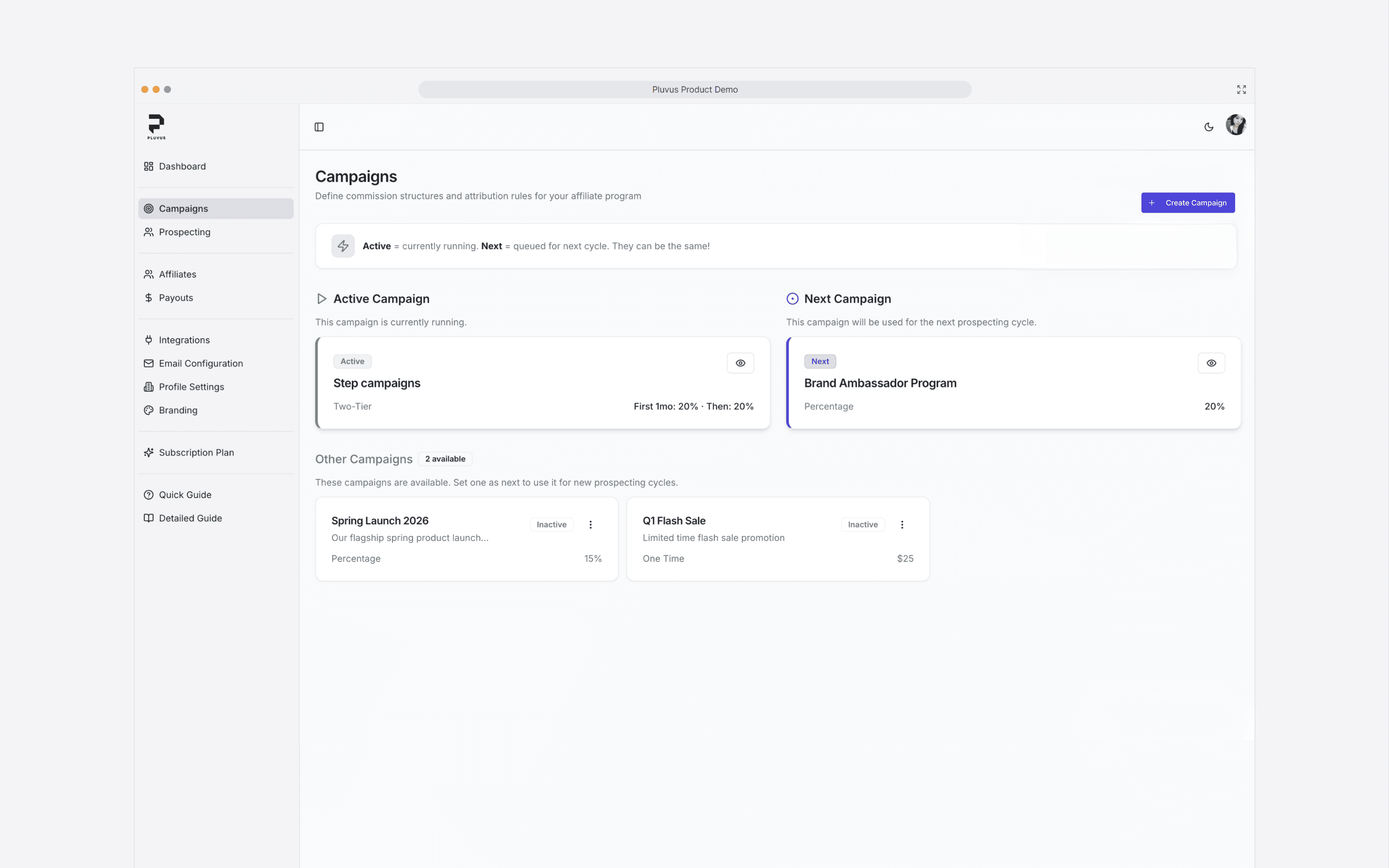
Before I touched anything, I looked at what Pluvus already had. Campaigns were basically a form: name, commission structure, and a status of Active, Next, or Inactive. That's it. There was no way to actually shape what a campaign did step by step. If a brand wanted their outreach to work differently or wanted a negotiation stage before payment, there was nowhere in the builder to put that.
That's where the disparity really showed up. Follow-ups, reply handling, negotiation, payment, fulfillment, these are all things a real campaign has to deal with, but the builder only ever gave you high-level settings like commission percentage and campaign type. Anything more specific than that had to happen manually, off to the side, which meant the "campaign" you built in Pluvus was more of a label than something that actually modeled the work.
That gap between how simple the builder looked and how much manual work was happening underneath it was the real problem. You could set up a campaign in a couple clicks, but the second you needed anything non-standard, there was nowhere to put it. The information on how creators were actually progressing lived scattered across separate tabs instead of the campaign itself, so the builder ended up feeling disconnected from the work it was supposed to be running.
Analyzing the Current Workflow
Before I touched anything, I looked at what Pluvus already had. Campaigns were basically a form: name, commission structure, and a status of Active, Next, or Inactive. That's it. There was no way to actually shape what a campaign did step by step. If a brand wanted their outreach to work differently or wanted a negotiation stage before payment, there was nowhere in the builder to put that.
That's where the disparity really showed up. Follow-ups, reply handling, negotiation, payment, fulfillment, these are all things a real campaign has to deal with, but the builder only ever gave you high-level settings like commission percentage and campaign type. Anything more specific than that had to happen manually, off to the side, which meant the "campaign" you built in Pluvus was more of a label than something that actually modeled the work.
That gap between how simple the builder looked and how much manual work was happening underneath it was the real problem. You could set up a campaign in a couple clicks, but the second you needed anything non-standard, there was nowhere to put it. The information on how creators were actually progressing lived scattered across separate tabs instead of the campaign itself, so the builder ended up feeling disconnected from the work it was supposed to be running.
Analyzing the Current Workflow
Before I touched anything, I looked at what Pluvus already had. Campaigns were basically a form: name, commission structure, and a status of Active, Next, or Inactive. That's it. There was no way to actually shape what a campaign did step by step. If a brand wanted their outreach to work differently or wanted a negotiation stage before payment, there was nowhere in the builder to put that.
That's where the disparity really showed up. Follow-ups, reply handling, negotiation, payment, fulfillment, these are all things a real campaign has to deal with, but the builder only ever gave you high-level settings like commission percentage and campaign type. Anything more specific than that had to happen manually, off to the side, which meant the "campaign" you built in Pluvus was more of a label than something that actually modeled the work.
That gap between how simple the builder looked and how much manual work was happening underneath it was the real problem. You could set up a campaign in a couple clicks, but the second you needed anything non-standard, there was nowhere to put it. The information on how creators were actually progressing lived scattered across separate tabs instead of the campaign itself, so the builder ended up feeling disconnected from the work it was supposed to be running.

Node-Based Solution
I kept coming back to a similar platform called Janney AI while I was working through this. They already had a node-based workflow builder, which felt like the right direction, but the interface itself was rough. A lot of it looked vibe coded, inconsistent spacing, no real hierarchy, and you couldn't customize much once you got past the basic flow. So I took the core idea, nodes as the unit of a workflow, and scaled it up to actually hold everything the PRD needed.
The sidebar became a node library organized by stage, prospecting, outreach, negotiation, fulfillment, attribution, so users could drag in exactly the step they needed instead of being stuck with a fixed sequence. Each node on the canvas got a collapsed card showing its type, a one-line summary, and live counts like in progress, waiting, and completed, so you could read the state of a whole campaign just by scanning down the pipeline. Clicking into a node opened its config panel on the right, keeping campaign-level setup, name, brand, objective, target pool, completely separate from step-level detail so neither one got cluttered.
Making this work at PRD scale meant every node had to follow the same contract no matter the type, an input, an output, a completion rule, a stop condition, so going from something like Reply Detection to Negotiation never felt like switching tools. I went through a bunch of rounds with the founder narrowing the visual language down to something neutral with a single accent color, since the goal was never to look flashy, it was to make a genuinely dense system feel readable at a glance, which is exactly where Janney AI fell short.
Node-Based Solution
I kept coming back to a similar platform called Janney AI while I was working through this. They already had a node-based workflow builder, which felt like the right direction, but the interface itself was rough. A lot of it looked vibe coded, inconsistent spacing, no real hierarchy, and you couldn't customize much once you got past the basic flow. So I took the core idea, nodes as the unit of a workflow, and scaled it up to actually hold everything the PRD needed.
The sidebar became a node library organized by stage, prospecting, outreach, negotiation, fulfillment, attribution, so users could drag in exactly the step they needed instead of being stuck with a fixed sequence. Each node on the canvas got a collapsed card showing its type, a one-line summary, and live counts like in progress, waiting, and completed, so you could read the state of a whole campaign just by scanning down the pipeline. Clicking into a node opened its config panel on the right, keeping campaign-level setup, name, brand, objective, target pool, completely separate from step-level detail so neither one got cluttered.
Making this work at PRD scale meant every node had to follow the same contract no matter the type, an input, an output, a completion rule, a stop condition, so going from something like Reply Detection to Negotiation never felt like switching tools. I went through a bunch of rounds with the founder narrowing the visual language down to something neutral with a single accent color, since the goal was never to look flashy, it was to make a genuinely dense system feel readable at a glance, which is exactly where Janney AI fell short.
Node-Based Solution
I kept coming back to a similar platform called Janney AI while I was working through this. They already had a node-based workflow builder, which felt like the right direction, but the interface itself was rough. A lot of it looked vibe coded, inconsistent spacing, no real hierarchy, and you couldn't customize much once you got past the basic flow. So I took the core idea, nodes as the unit of a workflow, and scaled it up to actually hold everything the PRD needed.
The sidebar became a node library organized by stage, prospecting, outreach, negotiation, fulfillment, attribution, so users could drag in exactly the step they needed instead of being stuck with a fixed sequence. Each node on the canvas got a collapsed card showing its type, a one-line summary, and live counts like in progress, waiting, and completed, so you could read the state of a whole campaign just by scanning down the pipeline. Clicking into a node opened its config panel on the right, keeping campaign-level setup, name, brand, objective, target pool, completely separate from step-level detail so neither one got cluttered.
Making this work at PRD scale meant every node had to follow the same contract no matter the type, an input, an output, a completion rule, a stop condition, so going from something like Reply Detection to Negotiation never felt like switching tools. I went through a bunch of rounds with the founder narrowing the visual language down to something neutral with a single accent color, since the goal was never to look flashy, it was to make a genuinely dense system feel readable at a glance, which is exactly where Janney AI fell short.