
2026
Desigining from a User Standpoint
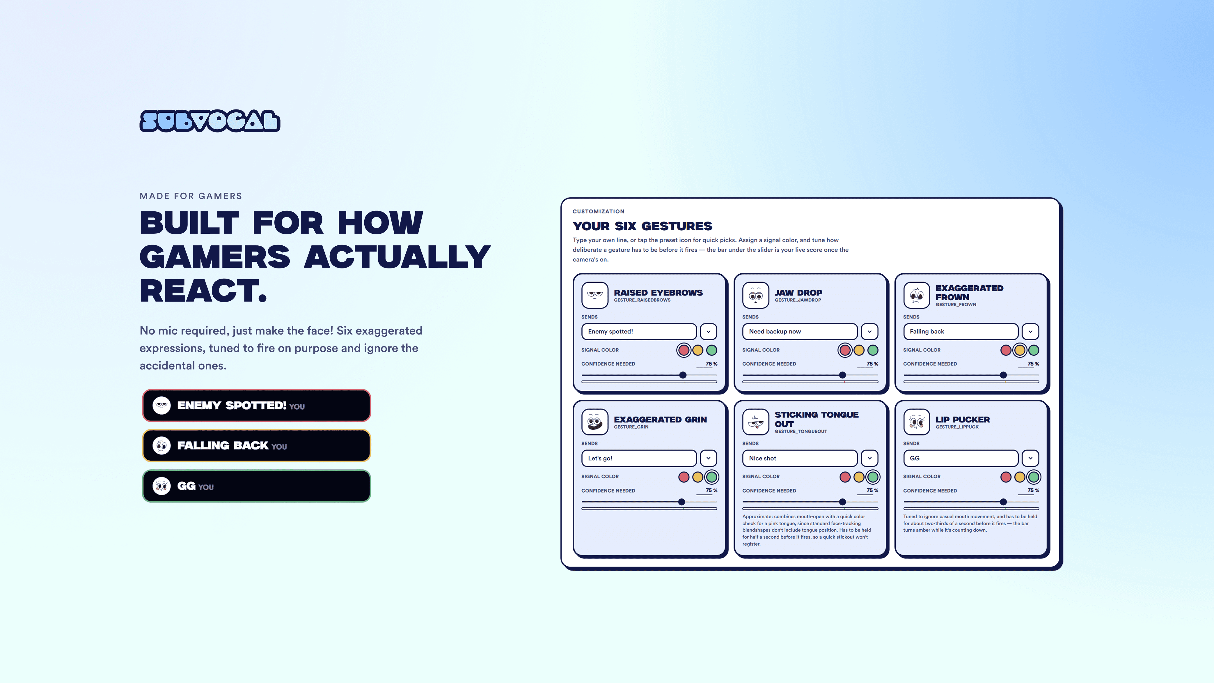
I started in Figma, laying out every screen before touching any code: the main hub, the gesture customization cards, the signal color panel, the friends system, and the overlay window itself. Working through it there first let me figure out how the different aspects actually connected, such as how a gesture maps to a message and how that message reaches a connected friend, before I had to worry about any of it actually functioning.
From there I moved into Claude Design to fine-tune the UI and the user flow itself, testing things such as how the confidence sliders should read, how a preset message gets swapped for custom text, and how the overlay should feel separate from the main settings hub. The color palette was inspired by a classic, bold and thick gaming-type font, with the colors being as intentional as possible by adding a color-coded message system (three signal colors: red for urgent, yellow for tactical, and green for support) layered on top so a teammate can read the urgency of a message before reading the words.
Once the UI and flow were locked, I used Claude Code to build it with actual on-device face tracking, a working overlay window that stays open until it's closed, and a backend that lets two different accounts send and receive messages in real time. I spent several days working on fleshing out the actual tunable gestures so users could customize the confidence intervals for each gesture, preventing gestures from misfiring and also ensuring intended gestures actually send.